Since De Facto Software was founded back in 1989, both our business and the industries we support have changed significantly.
Technology has evolved. Customer expectations have increased. Businesses have become more connected, data-driven, and operationally complex.
Over the years, our software has continued to evolve alongside those changes. Naturally, our branding has evolved too.
Where We Started
When De Facto was established 35 years ago, our original logo reflected the business at that point in its journey. Looking back, it's a reminder of how far both the company and the technology landscape have come over the last three decades.
While the logo may have changed, the purpose behind the business has remained remarkably consistent: helping businesses operate more effectively through technology that works around them, not against them.
Although our logo was updated some time ago, our website was refreshed last year to bring it in line with De Facto ERP—our cloud‑based, user‑friendly solution built on our Enterprise Data Platform (EDP) architecture.
Where We Are Now
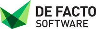
The inspiration behind our current logo comes from origami. At first glance, it may simply appear as a geometric illustration. But the thinking behind it runs much deeper.
Origami begins with a single sheet of paper. Through a series of precise folds, something unique starts to take shape. Every fold influences the next, gradually creating a structure that is both connected and purposeful. We felt this represented our approach to software perfectly.
Our solutions bring together many different elements of a business: financials, purchasing, sales, stock management, warehousing, CRM, reporting, E-Commerce, fulfilment and logistics.
Individually, each component serves a purpose. The real value comes from how those components work together as one connected solution. Just like origami, every element contributes to the final outcome.
Not Just a Slogan
One phrase that has become closely associated with our brand is: "Folded to your business shape and size."
For us, this isn't simply a marketing slogan - it reflects how we approach every project.
No two businesses operate in exactly the same way. A drinks distributor faces different challenges to a food manufacturer. An automotive supplier works differently to a packaging business. Even within the same industry, every organisation develops its own processes, priorities, and ways of working.
That's why our solutions are designed around the business itself. Built using our EDP technology, and refined to meet the exact operational needs of each customer.
Just as no two origami creations are identical, no two De Facto solutions are the same.
The Meaning Behind the Colours
The green tones used throughout our branding were chosen deliberately.
Green is often associated with growth, adaptability, balance, and progress - qualities that closely align with the businesses we support and the role technology plays in helping them evolve. The different shades also reflect the layers and interconnected nature of modern business operations, where information, people, and processes must work together seamlessly.
At the same time, we wanted a visual identity that would stand out. In a world of increasingly similar technology brands, we wanted something memorable, distinctive, and instantly recognisable - whether seen on our website, software, exhibition stand, or industry publication.
More Than Branding
For us, the logo has never been just a logo. It represents how we think about software, how we work with customers, and how we have continued evolving as a business. The technology may have changed. The branding may have changed. But the principle remains the same.
Understand the business first. Then shape the solution around it. Because no two businesses should ever be forced into the same shape.